Understanding Typography… A Guide to Usage

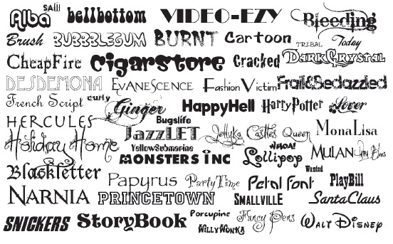
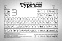
With literally thousands of typefaces available, it is no small matter to determine which ones to use for a specific document. In this issue we’ll present some guidelines to assist you in narrowing the choices, as well as information about increasing the effectiveness of the type you select.

Defining the Task

Regardless of the document you are preparing – brochure, newsletter, flyer, training manual, or direct mail marketing piece – your first task is to be sure the typeface you select promotes readability and comprehension for your audience. In turn, this requires careful attention to a typeface’s legibility.

Readability refers to how the letters interact when combined into words, sentences, and paragraphs. Legibility refers to the clarity of the type – how easily one letter can be distinguished from another.

Next, think about what you must accomplish with the document. The goal of a brochure is much different compared to the goal of an annual report or newsletter. For instance, a brochure must engage the reader’s interest quickly and tell a convincing story, while an annual report consisting of large blocks of text with charts and financial tables must explain without fatiguing the reader. For a newsletter, eye-catching headlines and an informal look may be the goal.

Then consider the demographics of the intended audience. What is the age range, educational level, attention span, and vocabulary of those you are addressing? Different typefaces appeal to different audiences: seniors look for clarity and legibility; teens are drawn to edgy, unusual type even at the expense of readability; children and beginning readers prefer larger, easy-to-read fonts.

Finally, think about how much reading you are requiring of your audience and what message you want them to take away. The more text your document contains, the more readable the font must be.

More…

More Than Ever Before… Type Matters

typeTypography has always been important as a design element in written documents. It attracts and holds the reader’s attention, indicates a hierarchy of information, creates harmony, and builds recognition without the reader being conscious of it. Good typography is part of the design structure that underlies effective communication.

Now, as the world develops a new visual culture in smart phones, tablets, notebooks and e-readers, we are beginning to realize just how influential typography is in providing information and shaping opinion. More than ever before, type matters.

More…

Ten Things You Need to Know About Typography

TypefacesTypography — both the design of letters and characters and the process of arranging type — is a central component of any graphic design project and is integral to communication. Good typography reinforces the meaning of the text, puts the reader at ease, allows the reader to devote less energy to the mechanics of reading, and causes the reader to pay more attention to the message.

Typeface or Font?
The terms typeface and font are used interchangeably today. However, in the days of metal type, there was a distinction. Font meant an alphabet (i.e., the upper and lower case letters, numerals, punctuation marks, and symbols) in a single size, weight, and style; while typeface meant a family of fonts in various sizes, weights, and styles.

• Size is the height of the alphabet and ismeasured in points (print) or ems (web).

• Weight; such as medium, bold, light, or black, is the thickness of the alphabet relative to its height.

• Style is the slant of the letters. Upright letters are known as roman, slanted is called italics or oblique.

When type was set by hand, all the letters and characters representing one font were separately stored in the drawer of a job case. Then technology replaced metal type, and changes in size, weight, and style were made by simple keyboard commands. The distinction between a typeface and font subsequently blurred to what it is today.

More…

Typography Basics for Documents and Web Sites

As we move forward with adding web-based communication methods to traditional print-based ones, it becomes clear that modifications to existing standards for print are needed. This is particularly true of typography since conditions for the web are quite different than for print.

Typography today is the result of Johann Gutenberg’s use of movable type in the mid- 1400s. He was the first European to use individual letters, numbers, and spaces to assemble into words, sentences, and pages that could be disassembled and used again. Movable type, combined with Gutenberg’s invention of oil-based ink and modification of agricultural presses for printing, became the basis for printing for centuries.

The process of manufacturing movable type in metal was continually improved and eventually fostered a true art form – the creation of alphabets, numerals, and characters in a single size, weight, and style (called a font) with distinctive characteristics, artistically rendered and mathematically balanced. Movable type progressed from crafting fonts individually to cutting matrices and casting the fonts with hot metal to compositing machines with molten lead vats that created whole lines of type on-the-fly (hot type). Eventually typecasting yielded to computerization – first as phototypesetting and later as desktop publishing.

For more…
http://www.macgra.com/1107Printips.pdf 

Which Typeface to Use…A Guide For Desktop Publishers

With literally thousands of typefaces available for use in desktop publishing, it is no small matter to determine which ones to use for a specific document. In this issue of Printips, we’ll present some guidelines to assist you in narrowing the choices, as well as information on how to increase the effectiveness of the type you select.

Regardless of the document you are preparing – brochure, newsletter, flyer, training manual, direct mail marketing piece – your first task is to be sure the typeface you select promotes readability and comprehension for your audience. In turn, this requires careful attention to a typeface’s legibility. Legibility refers to the clarity of the type – how easily one letter can be distinguished from another. Readability refers to how the letters interact when combined into words, sentences, and paragraphs.

Next, think about what you must accomplish with the document. The goal of a brochure is much different than the goal of an annual report or newsletter. For instance, a brochure must engage the reader’s interest quickly and tell a convincing story, while an annual report, consisting of large blocks of text with charts and financial tables, must explain without fatiguing the reader. For a newsletter, eye-catching headlines and an informal look may be the goal.

Then consider the demographics of the intended audience. What is the age range, educational level, attention span, and vocabulary of those you are addressing? Different typefaces appeal to different audiences: seniors look for clarity and legibility; teens are drawn to edgy, unusual type even at the expense of readability; children and beginning readers prefer larger, easy-to-read type.

Finally, think about how much reading you are requiring of your audience and what message you want them to take away. The more text your document contains, the more readable the typeface must be.

http://macgra.com/0601Printips.pdf

Typography from Gutenberg to Computers

One of the best things about being a printer is recognizing the role our profession has played in the educational, political, and religious life of mankind. In the Middle Ages, before printing was invented, scribes made books by handcopying manuscripts in distinctive calligraphic lettering. A single book could take years to produce using this method, meaning that only the church and nobility could afford them.

Printing made it possible to produce whole books in weeks rather than years. This, in turn, enabled the rapid spread of knowledge, ideas, literature, and news, profoundly shaping the development of whole societies.

Many people believe that the invention of printing hinged on the development of the printing press. Derived from presses used to squeeze the oil from olives and juice from grapes, the first printing presses used a heavy screw to force a block of type against the paper below.

But that’s only half the story. It wasn’t until Johannes Gutenberg perfected the technology of movable type in 1458 that the printing press realized its full potential. Movable type – letters of the alphabet, numerals, and punctuation marks constructed of durable metal – could be assembled into a page of text, then disassembled and re-used to create a new page of text.

http://macgra.com/0504Printips.pdf