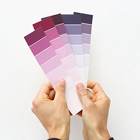
 Color is an essential element of communication. It can be used to shape perceptions, affect reactions, influence choices, and provoke responses. In marketing materials, it adds a dynamic to the structure – the general form and direction – of the words and image by highlighting and marking important content. The more you understand the language of color, the more effective you will be in speaking to your customers and prospects via your printed materials and web site.
Science describes how humans perceive color. Specifically, color is light. In his 1704 book, Opticks, the English natural philosopher Sir Isaac Newton described the fundamental nature of light as color. The book was based on his observation that when pure white light passes through a prism, it separates into a spectrum of seven hues (red, orange, yellow, green, blue, indigo, and violet) known as the visual spectrum.
In Opticks, Newton clearly stated that color is not a property of objects observed nor of light. Rather, it is a product of the mind. His proof was that he could create a color that was not part of the light spectrum (magenta) by overlapping two hues that were a part of it (red and violet). And when he connected the red and violet ends of the spectrum, he created the first color wheel, thus showing the relationship between the colors in the visible spectrum.
More…
 One of the more difficult tasks we face when reproducing your printed material is to be certain the color is correct. When we are printing your business stationery, it is critical that the color remains consistent for the first and for each subsequent printing. When printing your company brochure or newsletter, the color on the finished piece must conform to your expectations. And, if we are printing in full color – especially photographs of food or people’s skin tones – a good color match may make the document really stand out.