 Your business card. When you started your own business, it was probably the first thing you had printed. Or when you joined your company, your business cards may have been waiting for you on your first day of employment. You may even have saved a business card from your very first job – that’s how powerful it is to see your name in print.
Category Archives: Designing
Direct Mail Design… The Roles of Form & Function
 If you are like most of our customers, you have a lot of questions about designing an effective direct mail marketing piece. Should you use a post card, a self-mailer, or an envelope? Use lots of copy or lots of white space? Announce who the mail is from or build the reader’s curiosity? With so many variables to consider, where does one begin to seek the right answers?
To help sort through the maze of interlocking decisions, remember that there are two ways to judge how well a direct mail piece has been designed. One set of standards comes from the discipline of good graphic design; the other comes from what makes mail move efficiently through the mail stream. We believe both are important, and that a good strategy is to thoroughly understand each set.
Coated Paper… The Importance of the Surface
 When deciding on the paper to use for marketing materials, such as a brochure or sell sheet, many of our customers tell us, “I’d like a shiny paper; it looks so professional.”
We’re not sure how this association with shiny paper – which we printers refer to as coated paper – got started, but we have a theory. Full color printing requires a smooth, uniform paper surface and therefore almost always uses a sheet that has had a coating applied during the manufacturing process. The purpose of the coating is to improve the way the surface of the sheet receives the ink, and it works! Full color printing on a coated sheet looks sharp and bright – in a word, professional.
Alternative Ideas for Five Common Printing Projects
 As you would expect, there are some products we typically print for many of our customers. Letterheads, note pads, thank you notes, newsletters, and brochures are common business printing projects for which we print multiple orders each week.
In this issue we’d like to suggest some options for refreshing the look of these printed materials… with a few simple changes.
The Alphabet of Color… RGB, CMYK, & PMS
 One of the more difficult tasks we face when reproducing your printed material is to be certain the color is correct. When we are printing your business stationery, it is critical that the color remains consistent for the first and for each subsequent printing. When printing your company brochure or newsletter, the color on the finished piece must conform to your expectations. And, if we are printing in full color – especially photographs of food or people’s skin tones – a good color match may make the document really stand out.
So why is color matching such a problem for us? The answer lies in a combination of how color is created and how the human eye perceives color.
Renew, Refresh, Rejuvenate…Redesigning Your Ads
 When is it time to consider a redesign of your company’s advertising material? Some may answer, “when its effectiveness drops,” or “when the competition does,” or “when we hire a new marketing director.” We agree that these are good reasons, but we also would add that periodic redesign should be part of your regular advertising cycle. A good redesign will refresh your ads and renew them for your loyal customers and your prospects alike.
Signs That a Redesign May be Needed
Your company’s advertising material may need a redesign if any of these conditions exist:
- It has been more than five years since you first developed the advertising material.
- Your company today is much different than it was when the advertising material was developed.
- The target audience for your product or service has changed since the advertising material was developed.
Your advertising material may also show signs of aging in the selection of typeface, the layout, or the color palette.
The Four Basic Principles of Graphic Design
 “You might have gotten away with an ugly flyer in the past, but today your readers/customers/clients are influenced more than ever before by the visual presentation, and ugly flyers go to the bottom of the pile.”
Robin Williams, author of the Non-Designer’s book series
Whether your task is to design a sales brochure, a display ad, or a newsletter, the purpose is the same: to communicate a message to an audience and to produce a desired response. Put simply, you want to say something to someone so that the person takes a specific action. What this means is that the design you develop is not just about appearance – it is also about the performance of the target audience. Thus, good design is measured equally by form and function.
According to Robin Williams in her extremely popular Non-Designer’s Design Book, there are the four principles of design that underlie every design project:
- alignment
- proximity
- contrast
- repetition
A Guide to Postcard Marketing
 “Postcards are the simplest, most cost-effective format available. They’re an excellent choice for making an announcement or driving customers to a store, website, or event.”
United States Postal Service
A postcard is one of the most versatile, inexpensive, and effective tools you can have in your marketing tool kit. Compared to the effort and cost of a brochure or a traditional direct mail package mailed in an envelope, a postcard is quick, easy, and a great way to stretch your marketing budget. In addition, some kinds of postcards will help you keep your mailing list updated.
Brochure Content & Design Fundamentals
 A brochure is a descriptive piece of literature used for promoting your business or organization. It is one of the most important and fundamental components of marketing literature for businesses and organizations. Typically the first item produced after the letterhead, envelopes, and business cards, its purpose is to put a targeted message in the hands of prospects that is portable, easy to store, and easily passed on to others.
A printed brochure is an integral part of the sales process. It serves as a leave-behind after a sales call or meeting with prospective customers. It is also used as a way to respond to inquiries or to introduce new products or services when cold calling. As part of a direct mail campaign, it can be sent with a sales letter or used as a self-mailer. And finally, a brochure can be a point-of-purchase display to interest customers in additional products or services or to provide information.
Speaking the Language of Color
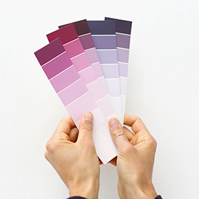 Color is an essential element of communication. It can be used to shape perceptions, affect reactions, influence choices, and provoke responses. In marketing materials, it adds a dynamic to the structure – the general form and direction – of the words and image by highlighting and marking important content. The more you understand the language of color, the more effective you will be in speaking to your customers and prospects via your printed materials and web site.
Science describes how humans perceive color. Specifically, color is light. In his 1704 book, Opticks, the English natural philosopher Sir Isaac Newton described the fundamental nature of light as color. The book was based on his observation that when pure white light passes through a prism, it separates into a spectrum of seven hues (red, orange, yellow, green, blue, indigo, and violet) known as the visual spectrum.
In Opticks, Newton clearly stated that color is not a property of objects observed nor of light. Rather, it is a product of the mind. His proof was that he could create a color that was not part of the light spectrum (magenta) by overlapping two hues that were a part of it (red and violet). And when he connected the red and violet ends of the spectrum, he created the first color wheel, thus showing the relationship between the colors in the visible spectrum.